Click for full-size.


CHAMPFLEURY. Auquel est contenu Lart & Science de la deue & vraye Proportio des Lettres Attiques, quo dit autremet Lettres Antiques, & vulgairement Lettres Romaines proportionnées selon le Corps & Visage humain.
by TORY, Geoffroy
- Used
- Hardcover
- first
- Condition
- See description
- Seller
-
Paris, France
Payment Methods Accepted
About This Item
[At the end :] Cy finist ce present Livre, avec Laddition de Treze diverses facos de Lettres, Et la manière de faire Chiffres pour Bagues dor, ou autrement. Qui fut acheve dimprimer Le mercredy. xxviij. Iour du Mois Dapuril. Lan Mil Cincq cens. XXIX. Pour Maistre Geofroy Tory de Bourges… Et pour Giles Gourmont aussi Libraire demorant au dict Paris… [28 avril 1529].
Small folio [245 x 169 mm] of (8) and (80) leaves, slight restoration in the margin of the title-page, red morocco, decoration with small tools inside gilt fillets, spine ribbed and decorated, gilt inner border, gilt edges. Binding signed by Chambolle-Duru around 1865.
" Rare and much sought-after first edition of this brilliant work, the masterpiece of G. Tory and one of the most beautiful books of all times. It is illustrated with xylographic reproductions of the various alphabets, writing models, flowered letters, interlaced figures and numerous woodcut figures. " (Jacques Guérin).
By the extent of his curiosities, by the variety of his skills (bookseller, typographer, artist and engraver, philologist and translator), Tory embodies well the innovative vigor of the humanist spirit. Born in Bourges, from a family of farmers, he first undertakes a university career, exploiting all the resources of a double stay in Italy, before devoting himself passionately to book creation in all its forms.
The printing shop foreman Protée, bookseller-publisher "rue Saint-Jacques, à l'enseigne du Pot Cassé", is the first to dissert on his art "Le Champ Fleury is not only a treatise devoted to typography or to the aesthetics of the book, it is moreover a manifesto, twenty years before that of Du Bellay, which purpose is to exalt the merits and the dignity of the French language".
Tory tries to establish a relationship between letters and the proportions of the human body (considered as a measure of all things). The treaties of Pacioli and Alberti inspired this picturesque dogmatism. More decisive is his action to give the coup de grâce to the old gothic alphabets in favor of the Roman character. To do this, he designed alphabets of an elegance never surpassed. It is necessary, he says, "escripre en françois comme François nous sommes"; hence his concern to codify the grammar. He demands the use of the acute accent, the apostrophe, the cedilla that his disciple Garamond and Robert Estienne will introduce according to his wishes. His remarks on the phonetics of the patois (picard, lyonnais, berrichon, parisian...) contributed to the history of the language and made him a pioneer in dialectology.
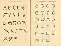
"If the Champ Fleury is one of the most famous books of the French Renaissance, it is because the book is the visual archetype, where the theorist implemented a new architectural conception. Indeed, the book vividly illustrates the expression of an order that is both balanced and subtle, free of Gothic influences and the manuscript tradition. It is illustrated with about a hundred woodcut compositions: diagrams, capital letters, and thirteen plates of alphabets and models of interlaced or fanciful letters. By their charm and interest, the most remarkable figures are the Gallic Hercules, the Triumph of Apollo and the muses, and the illustrious mark "au Pot Cassé" placed in a large Renaissance frame. Jean Perréal and Godefroy le Batave, painters and illuminators attached to King François I, contributed to the illustration, which can no longer be attributed entirely to Tory as it once was. On the other hand, we could give him back the printing of the work itself, which would later earn him the coveted title of "Printer to the King", which Francis I had not yet granted to anyone.
In old French, Champ Fleury means Paradise. The admirable awakener that is Geofroy Tory invites the reader in this Garden of Plaisance of a gushing greenness where swarm all kinds of the most precious and the strangest flowers".
(Ghislaine Quentin).
"It is the first didactic work written in French language. Geoffroy Tory wanted to lay the foundations of a new French grammar (he proposed the use of apostrophes, accents and the cedilla) and to create fixed rules for the manufacture of the printing characters. It is under the influence of the Champfleury that the gothic letters were abandoned; one will remember that Garamond was a student of Geoffroy Tory." (Jacques Guérin).
"The apology of the French language, the exhortation to use it in preference to Latin, hold a great place there. Tory tried to simplify, even to establish, certain rules of grammar and pronunciation: his colourful advice Au lecteur, which Rabelais copied in part in his Discours du beau parleur limousin, deals, among other things, with the pronunciation of words by foreigners or provincials. Tory's work predates Du Bellay's Deffence et Illustration de la Langue françoyse by twenty years and precedes by ten years the Edict of Villers-Cotterêts of Francis I, which made the use of French in state documents compulsory. It has considerable appeal and stands out as an original work reflecting a keen artistic concern. Tory's culture and taste have imprinted on the productions associated with his name the mark of a personal and endearing style. It is next to Tory, and perhaps benefiting from his influence, that the most elegant printers of his time were formed, like the perfect Janot, Augereau, Pierre Vidoue and the remarkable Simon de Colines to whom, besides, Tory will address in 1530 to print his Aediloquium". (Pierre Berès).
"The illustration, which is entirely by Tory's hand, includes demonstrative figures on the construction of capital letters, 11 plates of alphabets and models of figures and interlaced letters. The most remarkable figures are: on l. 3 v°, a beautiful vignette of the Gallic Hercules, dated 1526. The author indicates that he saw this 'fiction in rich painture in Romme' and that he made a drawing of it. On l. 22 v°, a beautiful figure of a naked man; on l. 29 v°, two exquisite vignettes representing the Triumph of Apollo and the Muses, and that of Ceres and Bacchus; on l. 63 v°, an emblematic figure of the Y that the author comments on and dedicates to the lovers of virtue; on l. 65, the letter Z surmounted by a genius holding a sceptre and a crown" (Brun, Le Livre français illustré de la Renaissance, 304).
This first edition is among the most sought-after of the 16th century.The Jacques Guérin copy in a rubbed contemporary binding was sold for nearly 700,000 FF (about 106,000 €) 37 years ago (Tajan, March 29, 1984, n° 97) and sold again 950,000 FF by Pierre Berès 33 years ago (1988, n° 96).
Twenty-six years ago, the Schaefer copy, "rebacked and cracked" was sold for £ 78,000 (€112,000).
Since that date, two new copies have appeared on the market; the first one bound by Godillot, a mediocre 20th century bookbinder, sold for nearly € 60,000 26 years ago; the second one, bound in damaged 19th century calf "rebacked", sold for € 100,000 24 years ago (Christie's June 25, 1997, lot 144).
A precious copy with wide margins, preserved in its elegant binding by Chambolle-Duru, coming from John Fleming and Arthur and Charlotte Vershbow libraries sold for $60,000 by Christie's New York in 2013.
Français
[A la fin :] Cy finist ce present Livre, avec Laddition de Treze diverses facos de Lettres, Et la manière de faire Chiffres pour Bagues dor, ou autrement. Qui fut acheve dimprimer Le mercredy. xxviij. Iour du Mois Dapuril. Lan Mil Cincq cens. XXIX. Pour Maistre Geofroy Tory de Bourges… Et pour Giles Gourmont aussi Libraire demorant au dict Paris… [28 avril 1529].
Petit in-folio de (8) et (80) feuillets, infime restauration en marge du f. de titre, maroquin rouge, décor aux petits fers dans un encadrement de filets dorés, dos à nerfs orné, double filet or sur les coupes, roulette intérieure dorée, tranches dorées sur marbrures. Reliure signée de Chambolle-Duru vers 1865.
245 x 169 mm.
" Édition originale, rare et très recherchée, de ce génial ouvrage, le chef‑d'œuvre de G. Tory et l'un des plus beaux livres de tous les temps. Elle est ornée de la reproduction xylographique des divers alphabets, de modèles d'écritures, de lettres fleuries, de chiffres entrelacés et de nombreuses figures sur bois. " (Jacques Guérin).
Par l'ampleur de ses curiosités, par la variété de ses aptitudes (libraire, typographe, artiste et graveur, philologue et traducteur), Tory incarne bien la vigueur novatrice de l'esprit humaniste. Né à Bourges, issu d'une famille de laboureurs, il entreprend d'abord une carrière universitaire, exploitant toutes les ressources d'un double séjour en Italie, avant de s'adonner passionnément à la création du livre sous toutes ses formes.
Le prote Protée, libraire-éditeur " rue Saint-Jacques, à l'enseigne du Pot Cassé ", est le premier à disserter sur son art " Le Champ Fleury n'est pas seulement un traité consacré à la typographie ou à l'esthétique du livre, c'est de surcroît un manifeste, vingt ans avant celui de Du Bellay, dont le dessein est d'exalter les mérites et la dignité de la langue française ".
Tory cherche à établir un rapport entre les lettres et les proportions du corps humain (considéré comme mesure de toute chose). Les traités de Pacioli et d'Alberti ont inspiré ce dogmatisme pittoresque. Plus décisive est son action pour porter le coup de grâce aux vieux alphabets gothiques au profit du caractère romain. Pour ce faire, il dessine des alphabets d'une élégance jamais surpassée. Il faut, dit-il, " escripre en françois comme François nous sommes " ; d'où son souci de codifier la grammaire. Il réclame l'emploi de l'accent aigu, de l'apostrophe, de la cédille que son disciple Garamond et Robert Estienne introduiront selon ses vœux. Ses remarques sur la phonétique des patois (picard, lyonnais, berrichon, parisien…) contribuent à l'histoire de la langue et font de lui un pionner de la dialectologie.
" Si le Champ Fleury est un des plus célèbres livres de la Renaissance française, c'est qu'il en est l'archétype visuel, où le théoricien s'est appliqué à mettre en œuvre une conception architecturale nouvelle. En effet, l'ouvrage illustre avec éclat l'expression d'une ordonnance à la fois équilibrée et subtile, dégagée des influences gothiques et de la tradition manuscrite. Il est illustré d'une centaine de compositions gravées sur bois : diagrammes, lettres capitales, treize planches d'alphabets et de modèles de lettres entrelacées ou fantaisistes. Par leur charme et leur intérêt, les figures les plus remarquables sont l'Hercule gaulois, le Triomphe d'Apollon et des muses, et l'illustre marque " au Pot Cassé " placée dans un large encadrement Renaissance. Jean Perréal et Godefroy le Batave, peintres et enlumineurs attachés au roi François Ier, ont contribué à l'illustration, qui ne peut plus être attribuée entièrement à Tory comme naguère. En revanche, on pourrait lui restituer l'impression même de l'ouvrage qui lui vaudra un peu plus tard le titre si envié d' " Imprimeur du roi ", que François Ier n'avait encore accordé à personne.
En ancien français, Champ Fleury désigne le Paradis. L'admirable éveilleur qu'est Geofroy Tory convie le lecteur en ce Jardin de Plaisance d'une verdeur jaillissante où fourmillent toutes espèces de fleurs les plus précieuses et les plus étranges ".
(Ghislaine Quentin).
" C'est le premier ouvrage didactique écrit en langue française. Geoffroy Tory veut jeter les bases d'une nouvelle grammaire française (il propose l'emploi des apostrophe, des accents et de la cédille) et créer des règles fixes pour la fabrication des caractères d'imprimerie. C'est sous l'influence du Champfleury que furent abandonnées les lettres gothiques ; on se souviendra que Garamond était un élève de Geoffroy Tory. " (Jacques Guérin).
" L'apologie de la langue française, l'exhortation à son emploi de préférence au latin, y tiennent une grande place. Tory tentait de simplifier, voire d'établir, certaines règles de grammaire et de prononciation : son truculent avis Au lecteur, que Rabelais copiera en partie dans son Discours du beau parleur limousin, traite, entre autres, de la prononciation des mots par les étrangers ou les provinciaux. L'ouvrage de Tory est antérieur de vingt ans à la Deffence et Illustration de la Langue françoyse de Du Bellay et précède de dix ans l'édit de Villers-Cotterêts de François Ier, qui rendait obligatoire l'usage du français dans les actes de l'Etat. Il exerce un attrait considérable et s'impose comme une œuvre originale reflétant une vive préoccupation artistique. La culture et le goût de Tory ont imprimé aux productions liées à son nom la marque d'un style personnel et attachant. C'est à côté de Tory, et bénéficiant peut-être de son influence, que se sont formés les plus élégants imprimeurs de son temps, comme les parfaits Janot, Augereau, Pierre Vidoue et le remarquable Simon de Colines auquel Tory s'adressera d'ailleurs en 1530 pour imprimer son Aediloquium ". (Pierre Berès).
" L'illustration qui est entièrement de la main de Tory comporte des figures démonstratives sur la construction des lettres capitales, 11 planches d'alphabets et de modèles de chiffres et de lettres entrelacées. Les figures les plus remarquables sont : au f. 3 v°, une belle vignette de l'Hercule gaulois, datée 1526. L'auteur indique qu'il a vu cette 'fiction en riche painture dedans Romme' et qu'il en a fait un dessin. Au f. 22 v°, belle figure d'homme nu ; au f. 29 v°, deux exquises vignettes représentant le Triomphe d'Apollon et des Muses, et celui de Cérès et de Bacchus ; au f. 63 v°, figure emblématique de l'Y que l'auteur commente et dédie aux amateurs de vertu ; au f. 65, la lettre Z surmontée d'un génie tenant sceptre et couronne. " (Brun, Le Livre français illustré de la Renaissance, 304).
Cette édition originale compte parmi les plus recherchées du XVIe siècle. L'exemplaire Jacques Guérin en reliure d'époque frottée fut adjugé près de 700 000 FF (environ 106 000 €) il y a 37 ans (Tajan, 29 mars 1984, n° 97) et revendu 950 000 FF par Pierre Berès il y a 33 ans (1988, n° 96).
Il y a 26 ans, l'exemplaire Schaefer, " rebacked and cracked " était adjugé £ 78,000 (112 000 €).
Depuis cette date, deux nouveaux exemplaires sont apparus sur le marché ; le premier relié par Godillot, médiocre relieur du XXe siècle, adjugé près de 60 000 € il y a 26 ans ; le second, relié en veau abîmé du XIXe siècle " rebacked ", adjugé 100 000 € il y a 24 ans (Christie's June 25, 1997, lot 144).
Précieux exemplaire à belles marges, conservé dans son élégante reliure de Chambolle-Duru, provenant des bibliothèques John Fleming et Arthur et Charlotte Vershbow adjugé 60 000 $ par Christie's New York en 2013.
Reviews
(Log in or Create an Account first!)
Details
- Bookseller
- LIBRAIRIE CAMILLE SOURGET
 (FR)
(FR)
- Bookseller's Inventory #
- TBF5
- Title
- CHAMPFLEURY. Auquel est contenu Lart & Science de la deue & vraye Proportio des Lettres Attiques, quo dit autremet Lettres Antiques, & vulgairement Lettres Romaines proportionnées selon le Corps & Visage humain.
- Author
- TORY, Geoffroy
- Book Condition
- Used
- Quantity Available
- 1
- Binding
- Hardcover
- Weight
- 0.00 lbs
Terms of Sale
LIBRAIRIE CAMILLE SOURGET
30 day return guarantee, with full refund including original shipping costs for up to 30 days after delivery if an item arrives misdescribed or damaged.
About the Seller
LIBRAIRIE CAMILLE SOURGET
Biblio member since 2020
Paris
About LIBRAIRIE CAMILLE SOURGET
The Bookshop Camille Sourget is specialised in literary first editions, travel books and atlases, scientific books as well as any beautiful illustrated books that marked their century. Its area of expertise extends from the 15th to the beginning of the 20th century.
Glossary
Some terminology that may be used in this description includes:
- Gilt
- The decorative application of gold or gold coloring to a portion of a book on the spine, edges of the text block, or an inlay in...
- Vignette
- A decorative design or illustration placed at the beginning or end of a ...
- G
- Good describes the average used and worn book that has all pages or leaves present. Any defects must be noted. (as defined by AB...
- Morocco
- Morocco is a style of leather book binding that is usually made with goatskin, as it is durable and easy to dye. (see also...
- Leaves
- Very generally, "leaves" refers to the pages of a book, as in the common phrase, "loose-leaf pages." A leaf is a single sheet...
- New
- A new book is a book previously not circulated to a buyer. Although a new book is typically free of any faults or defects, "new"...
- First Edition
- In book collecting, the first edition is the earliest published form of a book. A book may have more than one first edition in...
- Edges
- The collective of the top, fore and bottom edges of the text block of the book, being that part of the edges of the pages of a...
- Calf
- Calf or calf hide is a common form of leather binding. Calf binding is naturally a light brown but there are ways to treat the...
- Spine
- The outer portion of a book which covers the actual binding. The spine usually faces outward when a book is placed on a shelf....
- Folio
- A folio usually indicates a large book size of 15" in height or larger when used in the context of a book description. Further,...
Frequently asked questions

Using and Collecting Bookmarks
Bern Marcowitz warns against paperclips and other inappropriate page-savers, and offers a bit of advice on using and collecting bookmarks.

Beat Poet Michael McClure
From the fateful reading at Six-Gallery in 1955 to his novels, poetry, and stage productions, Michael McClure was right in the thick of the Beat Generation as it was born. See his books and art and learn more about the works of Michael McClure.
